out3Plot: Plots
This module gathers various functions for creating visualisations of simulation results,
analysis results, etc. Details on these functions can be found in out3Plot.
General plot settings can be found in out3Plot.plotUtils
and the respective configuration file out3Plot/plotUtilsCfg.ini.
In the following sections, some of these plotting functions are described in more detail.
plotUtils
out3Plot.plotUtils gathers the general settings used for creating plots as well as small utility functions.
makeColorMap
When plotting raster data, out3Plot.plotUtils.makeColorMap() is useful for deriving
a suitable colormap. As inputs, this function requires:
makeColorMap(colormapDict, minimum level, maximum level, continuous flag)
By setting the continuous flag, there is the option to return a continuous or discrete colormap. Within this function, several default colormaps are available, as for example the ones used to visualize flow thickness, flow velocity or pressure. These can be initialised by:
from avaframe.out3Plot import plotUtils
plotUtils.cmapThickness
A colormap dictionary is loaded with information about the colormap, specific colors and levels corresponding to the default option of visualising pressure in com1DFA. If the flag continuous is set to True, this function returns a colormap object and a norm object fitted to the minimum and maximim values provided as input parameters. If the continuous flag is set to False, it will return a colormap object and a norm object representing the discrete levels defined in the dictionary. The maximum level provided in the inputs will be added as maximum level of the colorscale. See the two example plots below, where the predefined levels correspond to 1, 10, 25, and 50 kPa and the maximum level provided as input is 320 kPa.
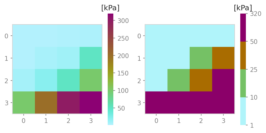
Fig. 36 left panel: continuous colormap. right panel: default discrete colormap used for pressure in com1DFA
In order to define customized discrete colorbars, there are different options. Firstly, provide a colorbar dictionary that follows the structure in the example dictionary:
from cmcrameri import cm as cmapCameri
colormapDict = {'cmap': cmapCameri.hawaii.reversed(),
                'colors': ["#B0F4FA", "#75C165", "#A96C00", "#8B0069"],
                'levels': [1.0, 10.0, 25.0, 50.0]}
It is also possible to provide key colors only. In this case the number of levels will match the number of colors and are equally distributed between the provided maximum and minimum value. If neither colors nor levels are provided in the dictionary, a default of six levels will be used. Another option is to just provide a colormap object instead of a dictionary. Here the continuous flag will be ignored and a colormap object as well as a norm object fitted to the maximum and minimum value will be returned.
outQuickPlot
out3Plot.outQuickPlot is used to generate plots of raster datasets,
as for example the simulation results of com1DFA. The x- and y-axis are shown in meters, where
the origin (0, 0) is set to the lower left center coordinate of the raster datasets.
generatePlot
out3Plot.outQuickPlot.generatePlot() creates two plots, one plot with four panels, first dataset, second dataset, the absolute difference of the two datasets
and the absolute difference capped to a smaller range of differences (ppr: +- 100kPa, pft: +-1m, pfv:+- 10ms-1).
The difference plots also include an insert showing the histogram and the cumulative density function of the differences.
The second plot shows a cross- and along profile cut of the two datasets.
In addition to the plots, a dictionary is returned with information on the plot paths,
as well as the statistical measures of the difference plots, such as mean, max and min difference.
Details on the required inputs for this function can be found in out3Plot.outQuickPlot.generatePlot().
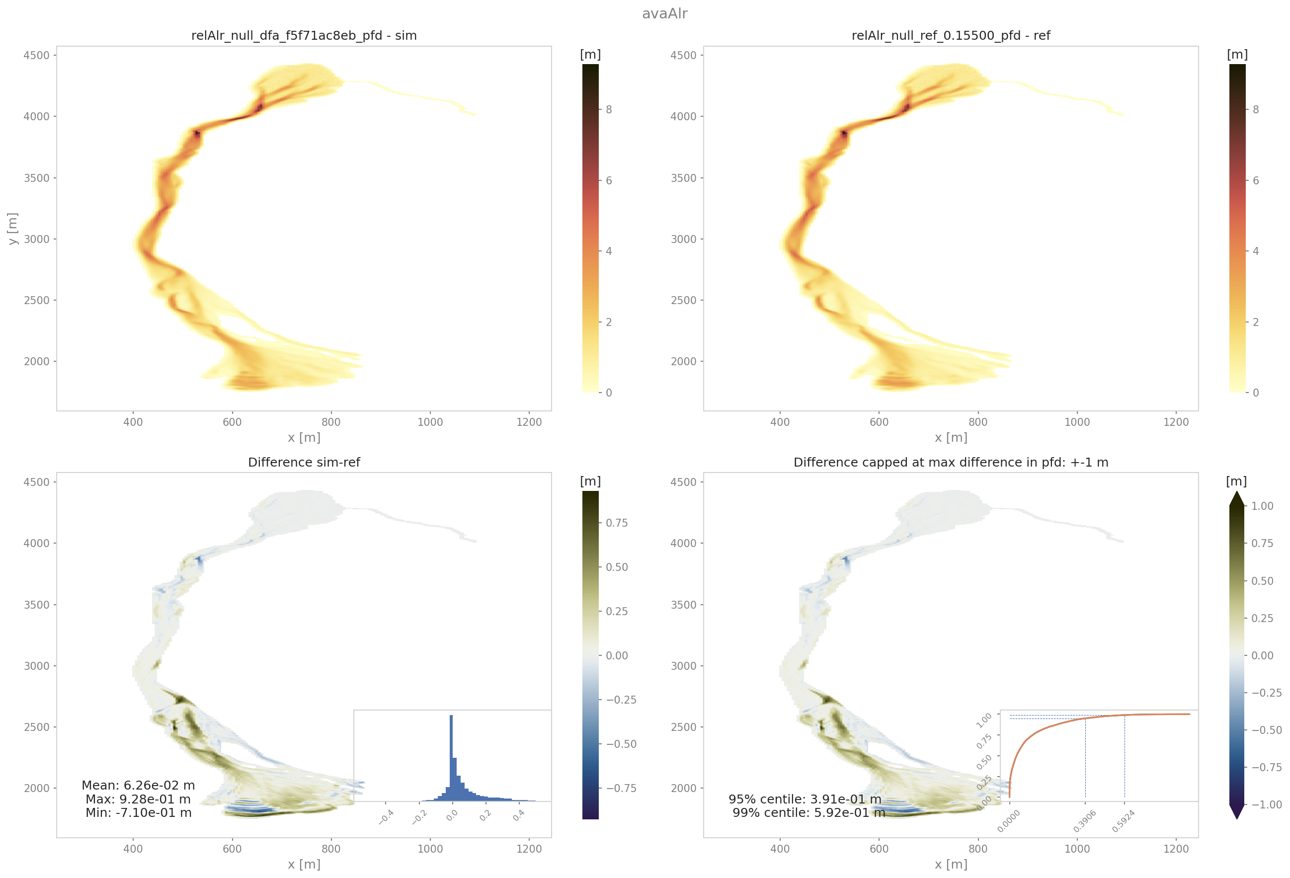
Fig. 37 Output plot from generatePlot on peak flow thickness results
quickPlotBench
out3Plot.outQuickPlot.quickPlotBench() calls out3Plot.outQuickPlot.generatePlot() to generate all comparison plots between the results of
two simulations. This requires information on simulation names and paths to the simulation results and the desired result type.
For further details have a look at out3Plot.outQuickPlot.quickPlotBench().
quickPlotSimple
out3Plot.outQuickPlot.quickPlotSimple() is a bit more general, as it calls out3Plot.outQuickPlot.generatePlot()
to generate the comparison plots between of two raster datasets of identical shape in a given input directory, without requiring further information.
For further details have a look at out3Plot.outQuickPlot.quickPlotSimple().
To run
An example on how to create the difference plots for two raster datasets of identical shape is provided
in runScript/runQuickPlotSimple
first go to
AvaFrame/avaframecopy
avaframeCfg.initolocal_avaframeCfg.iniand set your avalanche directory and the flagshowPlotspecifiy input directory, default is
data/NameOfAvalanche/Work/simplePlotrun:
pixi run python runScripts/runQuickPlotSimple.py
generateOnePlot
out3Plot.outQuickPlot.generateOnePlot() creates one plot of a single raster dataset.
The first panel shows the dataset and the second panel shows a cross- or along profile of the dataset.
The function returns a list with the file path of the generated plot.
For further details have a look at out3Plot.outQuickPlot.generateOnePlot().
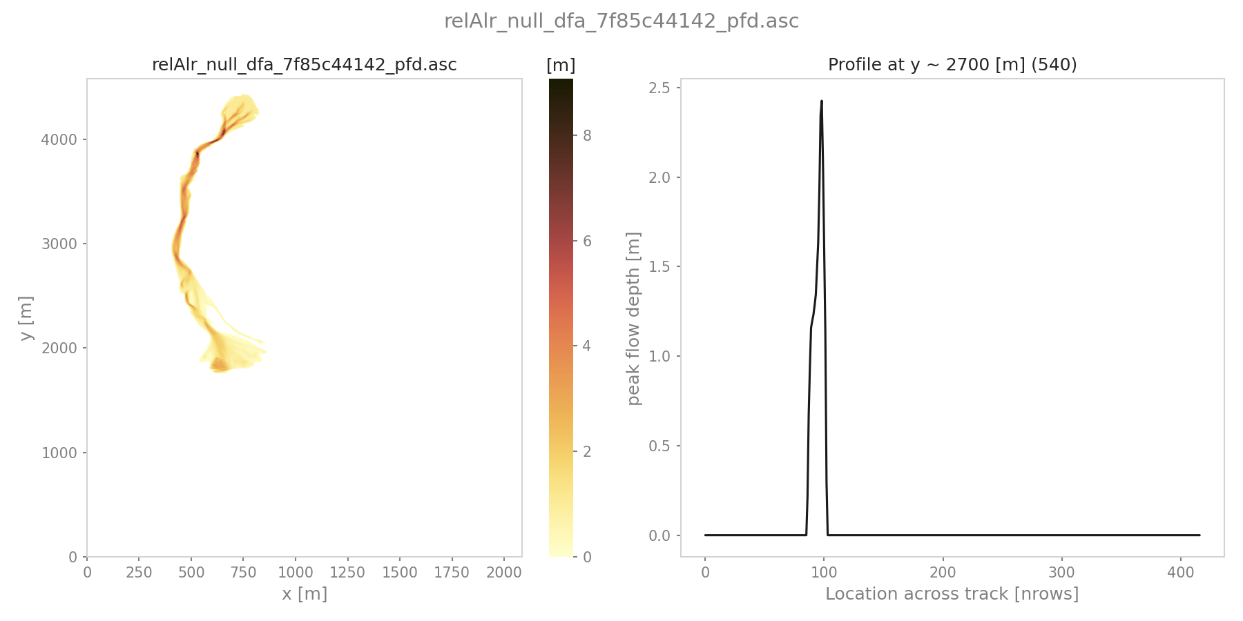
Fig. 38 Output plot from generatePlotOne on peak flow thickness results
quickPlotOne
out3Plot.outQuickPlot.quickPlotOne() calls out3Plot.outQuickPlot.generateOnePlot() to generate the plot corresponding to the
input data. For information on the required inputs have a look at out3Plot.outQuickPlot.quickPlotOne().
To run quickPlotOne
An example on how to create this plot from a given input directory or from the default one data/NameOfAvalanche/Work/simplePlot,
is provided in runScript/runQuickPlotOne
first go to
AvaFrame/avaframecopy
avaframeCfg.initolocal_avaframeCfg.iniand set your avalanche directory and the flagshowPlotcopy
out3Plot/outQuickPlotCfg.initoout3Plot/local_outQuickPlotCfg.iniand optionally specify input directoryrun:
pixi run python runScripts/runQuickPlotOne.py
in1DataPlots
out3Plot.in1DataPlots can be used to plot a sample and its characteristics derived with in1Data.computeFromDistribution,
such as: cumulative distribution function (CDF), bar plot of sample values, probability density function (PDF) of the sample,
comparison plot of empirical- and desired CDF and comparison of empirical- and desired PDF.
statsPlots
out3Plot.statsPlots can be used to create scatter plots using a peak dictionary where information on two result parameters of avalanche simulations is saved.
This peak dictionary can be created using the function ana4Stats.getStats.extractMaxValues() of ana4Stats.getStats.
This can be used to visualize results of avalanche simulations where a parameter variation has been used or for e.g. in the case of
different release area scenarios. If a parameter variation was used to derive the simulation results, the plots indicate the parameter values in color.
If the input data includes information about the ‘scenario’ that was used, for example different release scenarios, the plots use different colors for each scenario.
There is also the option to add a kde (kernel density estimation) plot for each result parameter as marginal plots.
An example on how these plotting functions are used and exemplary plots can be found in getStats
Additionally, a plotting function for visualising probability maps is provided by out3Plot.statsPlots.plotProbMap(), where probability maps can be plotted
including contour lines.
An example on how these plotting function is used and an exemplary plot can be found in
probAna - Probability maps.
plotValuesScatter
out3Plot.statsPlots.plotValuesScatter() produces a scatter plot of
result type 1 vs result type 2 with color indicating values of the varied parameter.
plotValuesScatterHist
out3Plot.statsPlots.plotValuesScatterHist() produces a scatter plot
with marginal kde plots of result type 1 vs result type 2 with color indicating different scenarios (optional).
plotHistCDFDiff
out3Plot.statsPlots.plotHistCDFDiff() generates the histogram plot and CDF plot of a input dataset.
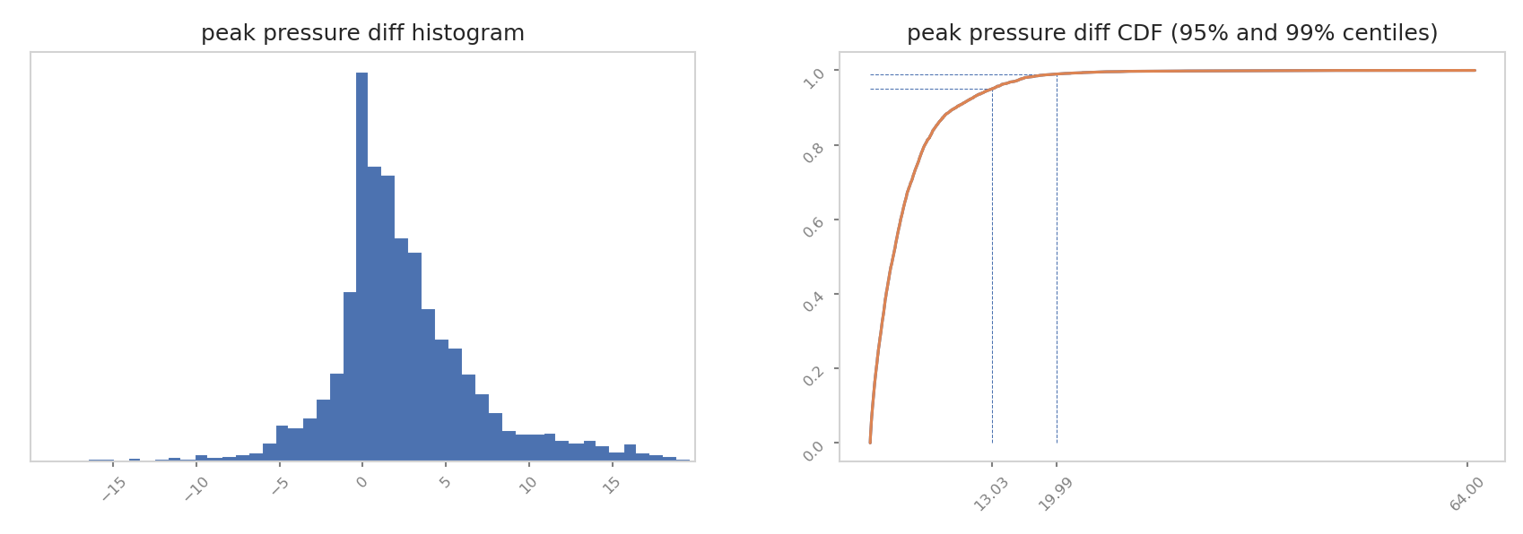
Fig. 39 Output plot from plotHistCDFDiff on peak pressure results from two simulations of avaAlr
particle analysis plots
out3Plot.particleAnalysisPlots can be used to create plots of particle properties for a com1DFA simulation,
where particles refer to two-dimensional numerical columns (see Discretization).
The particle properties can be analyzed over time or transformed into a thalweg following coordinate system using ana3AIMEC.
Additional functions to compute velocity envelopes, i.e. the min and max values of the particle properties over time but also along the thalweg are used
(see out3Plot.outParticleAnalysis.velocityEnvelope() and out3Plot.outParticleAnalysis.velocityEnvelopeThalweg()).
The provided run script runScripts/runParticleAnalysis.py, provides an example of calling com1DFA to perform
an avalanche simulation and then perform the respective particle analysis including a coordinate transformation and producing the final plots,
which are examplary shown here:
Fig. 40 Particle properties summary plot showing a map view of the affected area (by all particles) based on the peak flow velocity field, the tracked particles trajectories in dark blue with the superimposed thalweg line. The panels in the middle row show the evolution of particles’ trajectory lengths, velocity and acceleration over time. In the rightmost panels, the particle data has been transformed into a thalweg following coordinate system and particle properties are shown along the thalweg coordinate \(S_{XY}\). The light blue area extends from the min value found for all particles to the max value and the blue solid lines indicate the values of the tracked particles.
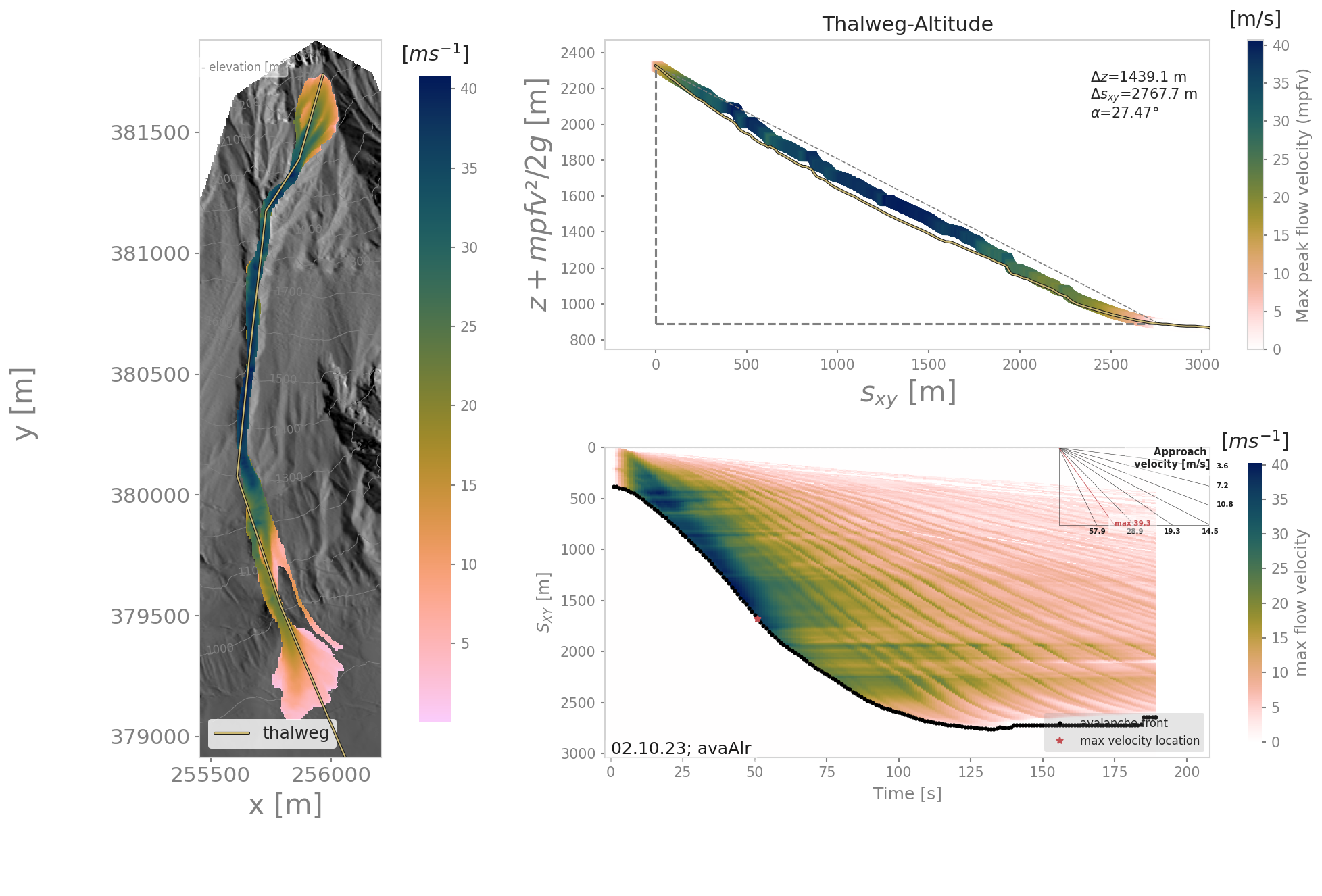
Fig. 41 The left panel shows a map view of the peak flow velocity field for the avalanche simulation with superimposed thalweg line. The top right plot shows the thalweg profile and the ‘velocity altitude’, i.e. the thalweg elevation plus the peak flow velocity cross max values along the thalweg to the power of two divided by two times the gravity acceleration, these values are then colored using the peak flow velocity cross max values. In the legend, the runout length \(\Delta {S_{xy}}\), altitude difference \(\Delta z\) and corresponding runout anlge \(\alpha\), measured using the peak flow velocity field and a threhsold of 1 \(ms^{-1}\) (default setting) are provided. The lower right panel shows the thalweg-time diagram for the respective simulation.
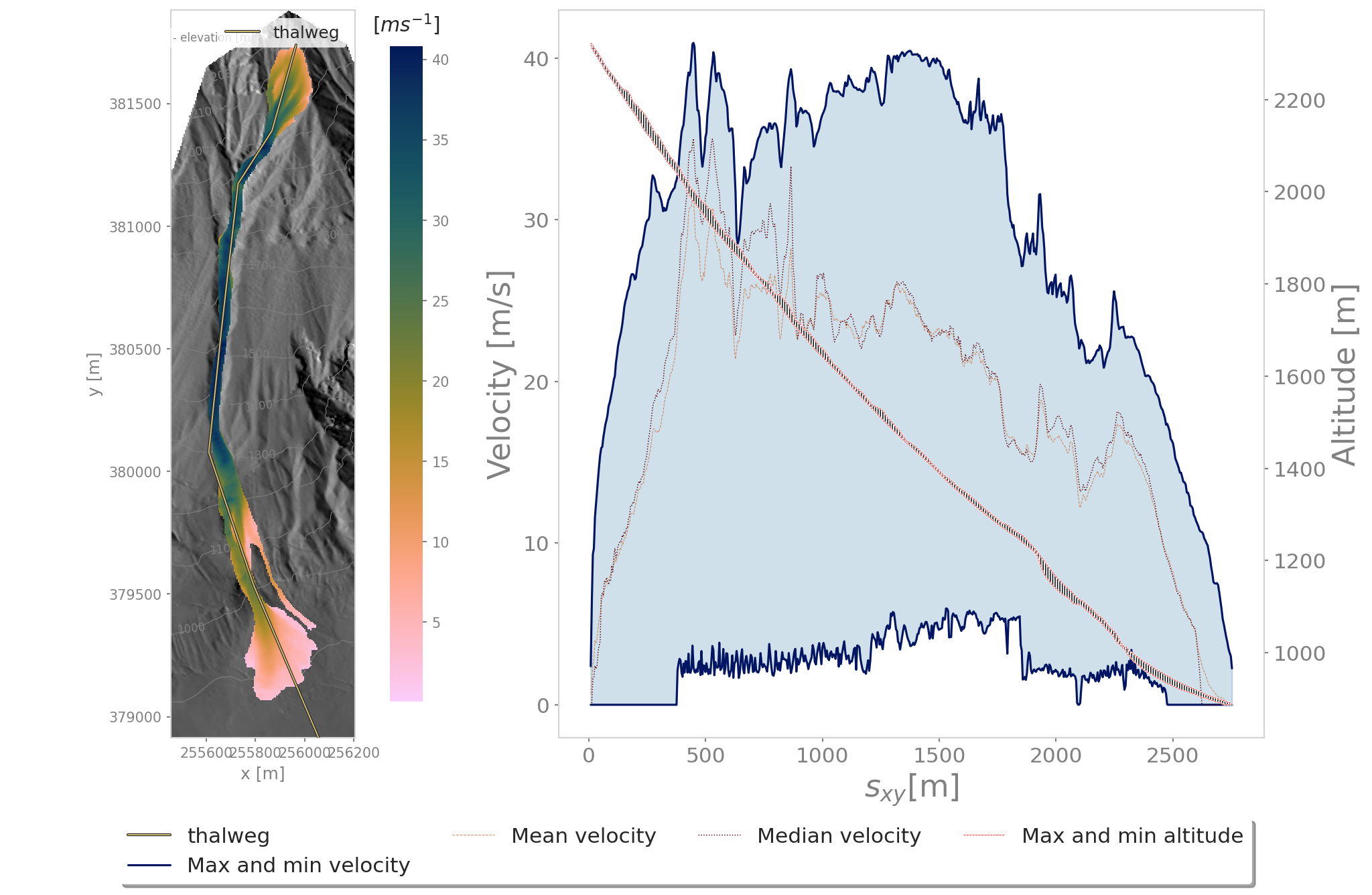
Fig. 42 The left panel shows a map view of the peak flow velocity field for the avalanche simulation with superimposed thalweg line. The right panel shows the velocity envelope for all particles, the mean and median particle velocity and the spread of altitudes covered by the particle positions along the thalweg coordinate.
Note
In order to create the presented plots, in addtion to the particle data also result fields of peak flow velocity are required.
To run
first go to
AvaFrame/avaframecopy
avaframeCfg.initolocal_avaframeCfg.iniand set your desired avalanche directory namecreate an avalanche directory with required input files - for this task you can use Initialize Project
in
AvaFrame/avaframe/out3Plot, copyoutParticleAnalysisCfg.initolocal_outParticleAnalysisCfg.iniand set your desired configuration for the analysis, the avalanche simulation run in com1DFA_override, the aimec analysis in ana3AIMEC_override and the range time diagram in distanceTimeAnalysis_override sectionrun:
pixi run python runScripts/runParticleAnalysis.py
particle assets information
out3Plot.particleAnalysisPlots can also be used to create a plot that shows the cells affected by the particle
trajectories color-coded according to different assets classes (from high to low). This functionality is implemented only
for com1DFA.com1DFA and relies on particle dictionaries that are saved for each simulation run. For this,
adding particles to the resType and adjusting the desired saving time step in tSteps (see Note) in your local copy
of `com1DFACfg.ini is required. To reduce the amount of data that is saved, consider only exporting the required
particle properties by setting exportParticlePorperties to: ID|indXDEM|indYDEM|x|y|z|inCellDEM|nPart.
In addition, an assets raster file in avalancheDir/Inputs/INFRA is required. Classes have to be > 0,
negative and zero values are treated as no data values. Preferably, the extent and resolution of the provided
assets raster should match the extent and resolution of the simulation DEM. If extents or resolution do not match,
remeshing will be performed. However, this can potentially introduce geometrical artefacts in the assets layer
(a corresponding warning will be written to the log-file). In order to avoid introducing new classes as a result
of interpolation, the default setting in the corresponding run script (parameter remeshInterpMethod)
is using a nearest-neighbor based interpolation. To perform the analysis (requires a prior com1DFA.com1DFA
simulation run using the settings described above):
run:
pixi run python runScripts/runParticlesAssetsInfo.py
Note
The setting of the saving time step tSteps has a strong effect on the results of the assets analysis.
Choosing a saving time step close to the computational time step dt (default value is 0.1s), will result in
most accurate results. When choosing a significantly larger time step, derived particle trajectories will lead
to gaps in the analysis, hence cells will not be attributed and color-coded correctly. Interpolation of particle
trajectories (setting: interpolateParticlesTrajectoriesFlag = True), can help to determine which cells are
affected but also with this option, if a too large saving time step (> 1 second) is chosen, errors have to be
expected. Hence, the default setting is interpolateParticlesTrajectoriesFlag = True and if saving time steps
exceed 2 seconds an error is raised.